
A Crichtoning thought
Boy have I got a review for you!
Movie critics typically review movies that have recently been released. That’s because there’s obviously no point in directing their reader’s attention to a film that came out thirty years ago. They might as well write about their feelings on overanalysed concepts like death, homosexuality, and censorship. Wait a second, I’ve written about all those things!
Well, I’m different from other movie critics in one very important way: I’m not a movie critic! I’m just a nutter who knows how to use a keyboard…

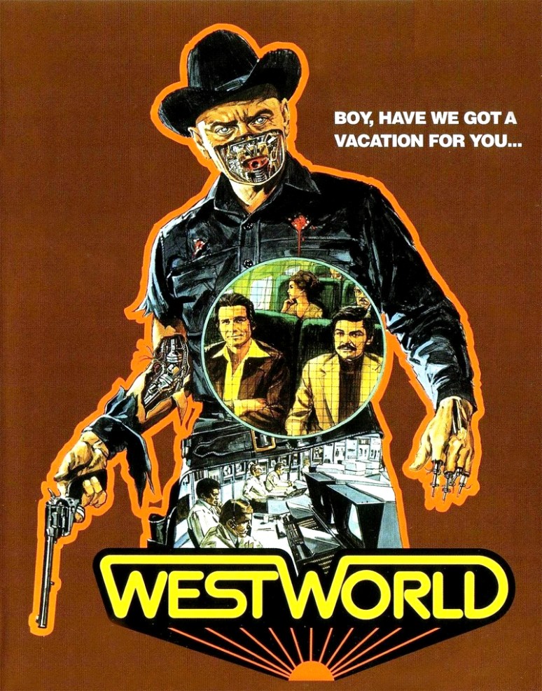
…so I don’t feel bound by those rules. The movie I’ll review for you today was made way back in the year nineteen-hundred and seventy-three, but I only saw it just recently. It’s Michael Crichton’s Westworld!
I’ve been something of a mini-fan of Michael Crichton for some time now, can you guess why?
Yeah, I’ll admit that is what brought him to my attention. Not long after I saw the film, I tracked down the novel to see how they compared. Then I read the sequel, The Lost World, and continued on from there with some of his other books – like Congo and Sphere.
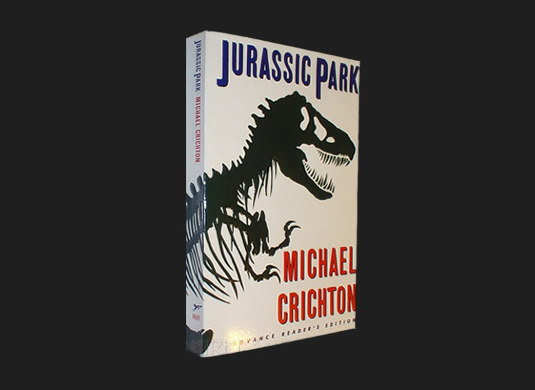
I always thought Michael Crichton was a truly unique writer. He had a strong passion for science fiction, and indeed science itself. Almost all of his novels have been adapted into films or mini-series’, and I think that’s because they translate so well. The premises he cooked up can very easily be adapted into screenplays. He loved to dive into discussions of scientific consequences – it was kind of his thing, making him a modern Mary Shelley. Jurassic Park is undeniably his most famous work, but did you know that it’s actually a self-inflicted remake?
I didn’t, but I found out quite recently. There was a whole other side to Michael Crichton that, surprisingly, I never knew about; he was also a film director. I don’t just mean that he tried it once for a kick, he directed seven movies! That’s more than Paul Thomas Anderson and the same amount as Quentin Tarantino.
Westworld was Michael’s first-ever theatrical feature:
“A robot malfunction creates havoc and terror for unsuspecting vacationers at a futuristic, adult-themed amusement park.”
– IMDB
Replace the robots with dinosaurs and you’d essentially have….Jurassic Park. It’s the same concept! Well, sort of..see Jurassic Park focused very heavily on genetic experimentation and cloning. It centered around the question of humanities control of nature and chaos vs. determinism. Westworld, however, features the much-loved science fiction theme of total automation. What happens when you leave everything, even the building of machines, up to machines?

Alright, I’ll stop comparing it to Jurassic Park and simply judge it on its own merits…
I really liked this film. It’s photographed in a very campy 70’s way, with very flat shots and smooth pans in favour of cranes and dolly’s, but I felt like that was intentional. The main characters are, after all, attempting to relive the “old west”. It makes sense, therefore, to shoot it like an episode of Bonanza. In fact everything about it reminds me of that; the writing, the acting, and the music. So, if you’re a fan of that style, then this will fit your sensibilities like a glove.
The other half of Westworld is very similar in tone to The Terminator. Halfway through, the main character is pursued by a lethal glitchy robot, called The Gunslinger, who has apparently selected him as his nemesis. Naturally The Terminator was made eleven years after Westworld, so the inspiration is the other way around.
Speaking of inspiration, is anyone here a Doctor Who fan? I know at least one of you is, and this part of the plot should therefore ring a little bell for you.
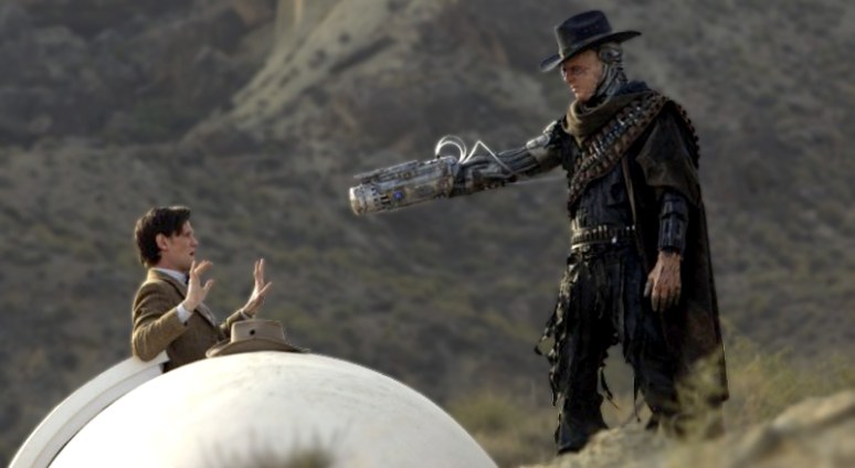
In the the third episode of Doctor Who‘s seventh season, entitled A Town Called Mercy, the characters encounter a cyborg cowboy named The Gunslinger. Inspired much? The creators of Doctor Who are clearly science fiction nerds who know their stuff.
This single movie has inspired a lot more pop-culture than I ever realised, even effecting the writers of The Simpsons…

…who’s episode Itchy and Scratchy Land saw the family travel to an automated Itchy & Scratchy themed amusement park which breaks down halfway through and turns deadly. They even quote many of the same lines.
There seemed to be more than just one theme being juggled at a time in this movie. Whilst all the cautionary science-fiction points are being made, there is also an alternate storyline about the motivations of the two main characters. They’re travelling to this world in order to escape the undesirable cocktail of misery and boredom that they experience in their day-to-day lives. You get the sense that they become addicted to it and, given no financial restrictions, would happily live in this fantasy world for the rest of their days. The problem is that it isn’t real, but the movie forces you to question whether the objective illegitimate nature of something even matters when your subjective experience is so convincing.
The cast will most likely be unknown to you, but you may turn up your ears at names like Yul Brynner and James Brolin. Yes, that’s a young James Brolin, father of Josh Brolin – who bears a striking resemblence to Christian Bale.
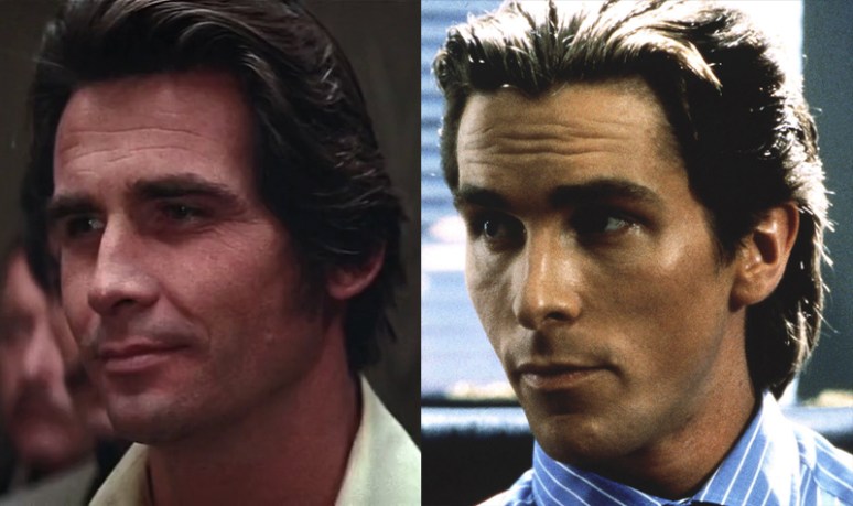
Isn’t that incredible? I guess reincarnation really is a thing…well, sort of. James Brolin is still alive, so it doesn’t really count.
I seriously think everyone needs to see this movie, even if it’s just as a little film-history lesson. It’s a classic masterpiece of scientific admonition. I appeal to you as a fellow ignoramus, I had never seen this movie until now but I’m so glad I did! Check out this trailer if you’re still unconvinced:

-Rant Over!
Logotomized
So, watching Argo recently I noted that the opening Warner Brothers logo was the 1972 version.
![]()
It was a nice retro touch, and was in tune with the central topic of the movie, but it also got me thinking about movie studio logos in general.
I doubt I’m the only one who loves movie studio logos. To me, that’s when the movie really begins. Just like the lights fading down and the curtains opening, these iconic images help to prep our excitement about the coming feature. I don’t care what movie I’m about to see, when the logos come up my heart rate does too and I grip the edge of my seat in anticipation.
We all know the most famous logos; 20th Century Fox, Warner Bros., Paramount, MGM, and Universal. Towering font, a golden shield, epic mountain peaks, a roaring lion, and…well…the earth, they all remind us of the majestic nature of powerful classic funding bodies.

When you see the logo history laid out like that it reveals some interesting marketing decisions. Clearly, as the years went by, every major studio has been trying to “out-gloss” each other. More gold! More sparkles! More colour!
It’s also interesting to see that both Warner Bros. and Paramount experimented with simpler images before regretting it and returning to the original overindulgent ones. What does that tell us about the movies? Evidently the audience has an expectation of “go big or go home”. They need to be wow’d from the very first second, and the logo needs to be the one to do that.
I suppose I should add Columbia Pictures to the list of “majors” but…instead let’s just stop talking about the big boys altogether. Sorry Columbia, you’re out before you even got in.

As always I want to give you the truth, and the truth this time is that the major studio logos aren’t really my favourites. Sure, it’s nice to see the classics fade up and out once in a while. It does make me feel like I’m in good hands, but over the years I’ve come to associate much stronger emotions with other, often less successful, company brands. That’s why I’m going to take you on a tour of…

Actually it’s even more encompassing than that. When I talk about the logos, I’m referring to the introductiory animations as well as the artwork.
Let’s start off with my comfortable little number 10:

Miramax, founded by Bob and Harvey Weinstein, gets its name from the combination of their parent’s first names; Max and Miriam, hence…Miramax.
Miramax is, in my mind, very much tied to adult drama/thrillers with an entertaining flair. Movies like Reservoir Dogs, Pulp Fiction, From Dusk Till Dawn, The Crow, The Piano, City of God, and There Will Be Blood were all either funded or picked up by Miramax. The crime comedy of Quentin Tarantino owes a lot to this little studio, and the creators clearly know that. It was no coincidence when, in 1998, they updated their logo to include a noir-lit city waking up to dark streets. It’s this nod to the urban nightlife of a metropolis that excites me every time I see it. There’s no music, other than the film’s score sometimes overlapping it, and the images therefore say it all.
I can’t be the only one who was tricked time and time again by the opening shot sweeping over a rippling ocean. I often fell for it, thinking “Oh, the movie starts somewhere out to sea!” before realising that it hadn’t started at all. Come on, admit that you did too…right?
In 2008 the Miramax logo was updated into a sparkling shiny new ultra-crisp CGI version of its former self. Yeah it’s better prepared for the High-Def world…but this one still has more edge to it.

Amblin’ was founded by Steven Spielberg and gets its name from his first 30-minute short film about the adventures of two hopeful hitchhikers, which you can watch in two parts here and here. They travel aimlessly across the countryside toward a mysterious destination, ergo…they are “amblin'”.
It’s rare that you see the Amblin’ Entertainment logo these days. I was pleasantly surprised to discover it during the opening of Super 8, which makes sense considering that it’s one giant tribute to the classic movies of Steven Spielberg.
Spielberg obviously used the most memorable image from E. T., of Elliot bicycling in front of the moon, as the central image in the logo. What’s great about that is that it instantly ties us to those special cinema years of wondrous childish optimism. There’s something very hypnotic about a full moon with the details of its asteroid-scarred surface presented to us like a lunar Rorschach test. Like the aftermath of a giant battle, we try to discern its history by deciphering the dark etchings in the pale white dust that-
-oh god, listen to me. When did I become Carl Sagan?
Again, no music. It’s a bummer, I know, but it still works for me. Every time I see it I’m not only reminded of E.T., but also of Back to the Future, Gremlins, Who Framed Roger Rabbit, The Land Before Time, Always, An American Tail, Casper, Men in Black…Ah, stop me before I cry! I hate that this logo has lost its once-abundant nature. Unlike every other logo, it hasn’t changed one bit since its inception and I hope it never does.

Anyone who grew up during the 90’s will have a very specific memory of TriStar Pictures.
See, TriStar began in the 80’s as a subdivision of Columbia Pictures (hence it features the same clouds in the background) and had a very iconic logo at that time. It wasn’t particularly pretty, I think, but it was very graceful. It featured, already then, a pegasus leaping off to the side of the camera. Obviously that was their attempt to create an iconic animal that could compete with MGM‘s Leo the Lion.
Then in 1993, they took their equine friend into a whole other dimension, the digital realm.
Notice something refreshingly different from the first two logos? Music! Glorious music! Just like the THX “Deep Note”, it makes sure to grab everyone’s attention – saying “are you watching and listening?”.
As I said, though, for the 90’s generation TriStar meant something different; this logo was on every fucking home-video I saw as a child. I swear, it was inescapable. Not that I’m complaining, I’m just saying that TriStar hit an unparalleled groove in that decade and exercised a monopoly on home-entertainment releases that I haven’t seen matched before or since. Did they invent the VHS or something? You have to admit, the winged horse was there with you practically every time you used your VCR. Those empty clouds, that sudden burst of heavenly light, the soaring horns of an orchestra fit for kings…aww, now I miss it. Bring back TriStar, bring back the pegasus!

Now we’re getting a little bit underground. I wouldn’t be surprised if most people reading this have never heard of Twisted Pictures, and that’s probably because you don’t watch a lot of horror.
Twisted Pictures exists because of the Saw films, as it was founded after the success of the first one. Naturally it’s a very small studio, but has grown as the franchise continued to be a lucrative one. What’s great about this company is that they take a very clear aim at the horror market. You can tell from the animation and the logo itself that they’re not going for a Disney–Pixar vibe. Good for them! They realised that there is a whole market out there of youth and adults who would love to put a name-brand to the sick, grungy, demented little genre they enjoy – and they tapped into that. Don’t expect these people to put out a cute and cuddly toy line along with their movies, unless they start selling Chucky dolls.
Isn’t that great? I love how little they care about the family-friendly pressures that made all the other studio’s knees buckle. With remakes of I Walked with a Zombie and The Body Snatchers in the pipeline Twisted Pictures is slowly but steadily expanding, so don’t be surprised if you see these guys going into major business over the next decade and beyond. There’s a lot of money to be made and movies to be shot that fit in perfectly with the ideals of this “little-studio-that-could”.

From one extreme to the other, there’s no way you haven’t heard of this one. Everyone knows the name Jerry Bruckheimer, it usually turns up right before the name Michael Bay.
Jerry Bruckheimer is like totally the most richest producer ever of movies and stuff! Sorry, I tried to articulate that properly, but I was distracted by the evils of pure envy. I imagined him sitting on a diamond-decorated gold throne, being served truffles and caviar by exotic beautiful women from every location on earth…and then I sort of blacked out, I don’t remember much after that. What day is it?
No, this is wrong, I shouldn’t be this materialistic. Movies shouldn’t be about the cash. There are more important things than wealth, right? I can’t seem to think of a single one at the moment but…regardless, money can’t buy everything. Like…um, it can’t buy…more money! Ahah!
The logo is pretty cool, even if I have no idea what it means. Lightning hits a tree near a road…ok then. Just like the Twisted Pictures logo, it reflects the ideals and interests of the company. It’s loud, bright, and exciting. You can’t argue with that.
It would be treasonous for me not to mention this studio logo. One reason is that it’s almost exactly as old as I am. It was founded just two months before I was born, meaning that they’ve never released a movie that I wasn’t around to see. Of course their first release was Arachnophobia, in in 1990 – when I was 1 year old – so it took a while before I was able to appreciate them.
I always loved the animation in this one. The warm glow being born behind the majestic sphinx gets me every time. I don’t know what it is, maybe because it’s so analogous to a sunrise or I’m intrigued by the mysterious identity of the silhouetted shape, but it sparks my imagination for sure.
This is another one of those animations that used to trick me whenever I saw it. I was continuously duped into believing that whatever movie I was watching started somewhere in the Egypt, that is until the name came up and I started mentally face-palming. What can I say, I wasn’t the brightest child.

You see the Touchstone logo from time to time, burned onto the black screen with its spanking new high definition icon. Indeed it’s nice to be reminded that they’re still around, but I don’t much care for the 00’s incarnation. I love the original representative image they provided for us, the one from the 80’s that showed up before films like Splash and Ruthless People. Do you remember it?
I wonder what it’s meant to be. I always thought of it as a burst of sunshine aimed directly at the moon. As the two opposites strike each other it creates a fissure in the fabric of the universe, out of which surges a rich torrent of imagination and inspiration…
…oh wait, touch stone….that makes more sense.
So now we enter back into the realm of no music. This one’s silent, folks, but it has a distinctly memorable presence.
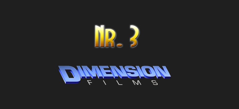
I know it will surprise some of you (…oh who am I kidding? All of you…) that I’m including this one. Hell, I’m not just including it, it’s all the way up at number 3! “But why?” you ask, with teary eyes and shaky voices. I can hear your confusion manifesting, it sounds like the cooling-fan of a laptop spinning out of its frame due to a lack of maintenance and being forced to bear a completely reprehensible information workload. Hmm, maybe I just need to free up some space on my Mac.
I understand that it leaves you perplexed, yet I love the Dimension Films logo. Maybe the image itself doesn’t tickle your tummy, but it does mine. I adore the way it materialises out of the dark like a steely blue apparition, ghostly in nature and menacing in tone. It’s frightening. It’s foreboding. It’s just…great.
Founded by the Weinsteins in 1992, Dimension was pitched as a film company focused on the teenage horror audience. What was their first film? Hellraiser III: Hell on Earth! Nice going, if the 90’s teen crowd don’t appreciate torture-fixated alter-dimensional demons then there’s just no pleasing them.
So the studio staggered on like that for a couple years, putting out tripe like Godzilla vs Biollante and Children of the Corn II, until they suddenly hooked their claws into a gorgeous new franchise; Scream! After the overwhelming success of the Scream films, they kept the ball rolling with Phantoms, The Faculty, Equilibrium, Wolf Creek, and Rogue. Those are only some of the most amazing films ever! I’ve always connected Dimension to that sort of quality, and that is why I love the logo.
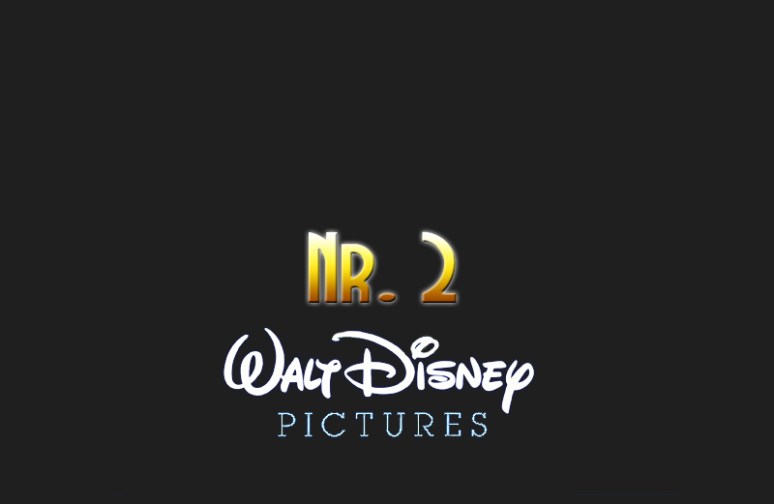
We all knew this was coming. I know I said that I didn’t think the most famous logo’s were the best, but this one desperately deserves the credit.
I don’t know which third world country you would have to grow up in to not have a strong childhood memory of the Walt Disney Pictures logo, but if that’s the case then I feel really sorry for you. Walt Disney is, to me, synonymous with magic. He was also synonymous with racism and antisemitism, and famously used racial slurs like pickaninny and nigg-
-LALALALALALALALALALALALALALALALALALALALALALALALALALALALALALALALALALALALALALALALALALALALALALALALALALALA-
-is it over, can I take my fingers out of my ears?
Ok fine, so maybe Walt Disney, the man, had issues. Whatever, he was a product of his time. Besides, he never lynched anyone. Leave it alone people, stop bringing it up in blogs and stuff. To me, Walt Disney is a logo. It’s something which transports me back to days of yore, when movies were stored on giants boxy videocassettes. The more you played them the more damaged and flickery the inside tape-spool became, but you never stopped loving your treasured copy of Fox and the Hound, Aladdin, 101 Dalmations, The Lion King, Bedknobs and Broomsticks, The Jungle Book, Mary Poppins, Peter Pan, Lady and the Tramp, Pinocchio…well, you can continue the list on your own.
The best part was always at the beginning, when the high pitched tune and glowing electric-blue tower welcomed us and foreshadowed our blissful journey into the realms of love and imagination. You all know what I’m talking about…
The new “digitised” 2006 three dimensional Disney logo is so boring compared to this traditional perfectly crafted 1985 creation. It’s so simple, so elegant, and yet so inspiring that I just couldn’t conceive of having it any lower than at number 2 on this list.
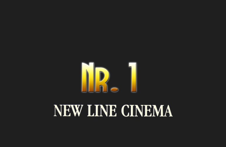
But even the contagious nature of the Disney bug was no match for this one. It’s the number one, the best, the logo of all logos! It’s New Line Cinema!
Ok, so the first plus in New Line‘s favour is that their very first movie ever released was the original A Nightmare on Elm Street. That’s right, at a time when no one would put their money behind Wes Craven’s creative vision of a dream-bound serial killer – New Line Cinema, a fresh virgin studio at the time, took the risky investment and ended up encasing Freddy Krueger in pop culture history forever. Their potentially dodgy bet payed off, which makes the whole thing a successful underdog story we can all appreciate. Without New Line Cinema we most likely wouldn’t have the Elm Street series nor Johnny Depp. That’s right, ladies, Mr. Depp spontaneously auditioned for A Nightmare on Elm Street on a dare with no prior ambitions of being an actor. He was hired, the film was made, and the rest is spectacular history. If you’re a fan of Johnny or anything that Wes Craven or the Nighmare on Elm Street movies have provided for you, then you owe New Line a large debt of gratitude.
That was point number one, point number two is just that it’s such a damn lovely animation! The sleek shiny jet-black panels tumble down in slow motion towards the cool mystical light below, gracefully freezing into position and locking together to form an image that suggests a strong but progressive love for innovative filmmaking. Oh, and the music, the music! Optimistic strings that sway over into warm conforming tones of harmony and coziness, it forms the very soundtrack to happiness and comfort. No one could ever hate this logo, it’s so beautiful!
My first memory of the New Line Cinema logo is when I went to see the film Lost in Space in 1998. Remember that? Everyone hated it, but I loved it. This animation faded up right before the movie started and I instantly fell in love with it. Now, whenever I hear that tune, I think of the Robinson family. If I could make a movie and choose any logo in front of it, i’d immediately go for this one. Sadly, Warner Bros. recently partnered with New Line and they decided to mash their logo’s together. The new animation is boring and ugly, I hate it.
I’m not living in a perpetual fantasy here, I know that these images are all brands, just like Nike and Coca-Cola. Also, almost every company listed here is partly or wholly owned by much larger companies. TriStar is a devision of Columbia, and Walt Disney ultimately owns Touchstone along with half of all the other media you can find in the world. Don’t get me wrong, I know that these logos are the equivalent of corporations staring me right in the face, but it doesn’t matter. For me, seeing them projected at the start of every cinematic embarkment melts my otherwise icy callous heart into a soup of “awwwww”. Do you have your own favourite movie logos, maybe even some from your childhood that have since all but disappeared? By all means share.
– Rant Over!
Strange bedfellows?

Ah, finally…
Too much working, not enough blogging. Time to get back to what’s really important, both important to me…and to…um…
…so anyways, I went to the movies again! Yay! Since I’m trying to save up a bit of money at the moment my trips to the cinema are unfortunately far fewer than they used to be, but I managed to catch a showing of Argo at the local (and only) neighbourhood cinema. For those of you who haven’t heard of Argo, it’s…
“A dramatization of the 1980 joint CIA-Canadian secret operation to extract six fugitive American diplomatic personnel out of revolutionary Iran.”
– IMDB
In order to do this, the CIA decided to give the diplomats a seemingly dodgy backstory; that they’re a filmcrew on a location scout for a science fiction movie. Argo is not only the name of this film, but also the name of the fake film they pretended to be making. Ergo Argo (hah!) is about a film within a film…except it’s not…because it’s about a film that was never made…but it was planned…but only as a cover story. Did I overcomplicate that? My head’s spinning…and my nose is bleeding…is that normal?
Granted, the movie-making dimensions of Argo are secondary to the political ones.
Still, the core theme of it is the meeting of these two apparently antithetical worlds. The director, Ben Affleck (Yes, the one from Gigli), clearly understands this. That’s why the film is infused with 70’s and 80’s filmmaking techniques. The opening Warner Brothers logo is lifted from that period, and the cinematography mimics it as well. The movie starts with a narrator explaining the political and economic situation in Iran leading up to the revolution. What’s interesting about it is not only the way it’s illustrated for us, which you’ll see when you watch the movie, but also the way it’s described; like it’s the setup to a science fiction adventure. It unravels almost like a fairy tale, with purity and atrocity translated to us in a way that could easily be transplanted into the plot of Star Wars. Let’s face it, science fiction is political, it always has been. As the movie continues – the line between those worlds disintegrates. We, the audience, start to see that movies and reality affect one another, and on a deeper level; that art, entertainment, and history are intricately woven together. Nowhere is this clearer than in the final shot, a perfect one that I would never dream of spoiling for you.
Argo also reminds us of what an extraordinary privilege it is to live in a country where we have the freedom to partake in creative endeavours like science fiction filmmaking and enjoy the fruit it bears.
As for the makeup of the movie itself, there’s a lot to enjoy. Ben Affleck not only directs, but also plays the main character; Tony Mendez. John Goodman and Alan Arkin portray a great cynical Hollywood duo who provide much of the stress-relieving comedy, balancing the entire piece beautifully. What could possibly be better than that? We also get a good dose of Bryan Cranston! Being a huge fan of Breaking Bad and an even bigger fan of Malcolm in the Middle before that, I’m very happy to see how well his career is going right now.
Was there anything I didn’t like? Sure, the amount of time allocated to the setup and execution of the operation seemed…wrong. There’s so much talking about how dangerous the mission is, and then when it actually takes place it’s over fairly quickly. I have no doubt that this reflected the schedule of events accurately, but cinematically it felt a little disproportionate. That’s the price you pay for adapting a real-life event, the movie still has to work as a movie.
There’s been a little Oscar buzz surrounding Argo, and I have to say that I wouldn’t be surprised if a golden statue eventually found its way into Mr. Affleck’s hands. Argo is a tremendous achievement, well worth everyone’s time.

– Rant Over!
Texas tensions

I saw quite a few movies recently, one of which was Skyfall. I wondered if maybe I should give it a review, but…what’s the point? There are enough critics slobbering all over its neck already, I don’t really feel like joining the orgy.
In fact, to be honest, there was one movie which I liked a little more than Skyfall and that was A Totally Deep-Fried Texas Redneck Trailer Park Murder Story. Oh wait, that’s just the tagline. So maybe the committee-to-decide-font-size made the wrong choice on the poster, but I can’t say that it’s innacurate. Killer Joe really does feature fast food, blood, murder, and trailer parks. Oh, and sex…lots and lots of inappropriate, awkward, and forceful sex. What genre is it? It’s a comedy!
Yes, a comedy, as in it’s meant to make you laugh. I know that seems unlikely, given what I’ve just described, but it’s a dark comedy in much the same way as American Psycho. If you can see the humour in it, then you’ll like it.
“When a debt puts a young man’s life in danger, he turns to putting a hit out on his evil mother in order to collect the insurance. Problem is, he doesn’t have enough money to pay the hitman either.
– IMDB
At a time of economic instability, when many people find themselves owing money to banks or insurance companies and some turn to paying one credit card off with another, many will be able to relate to the events that surround the main character in this film. We all know that feeling where you’re digging yourself into a deeper and deeper hole, eventually finding yourself unable to climb out. The difference is that here the events get so out of hand that the consequences reveal themselves in the form of murder, prostitution, molestation, theft, and torture.
First thing to say is that this movie is directed by William Friedkin, and thank goodness for that. I can’t imagine anyone else bringing this story to the screen in all its proper gut-punching glory. Friedkin can direct a ‘tense’ movie in his sleep. For goodness sake, the man made The Exorcist and The French Connection, he knows how to put the audience’s balls in a vice.
Second thing to say is that this film features Matthew McConaughey. Yes, that’s the same Matthew McConaughey who insists on taking his shirt off at every given opportunity and apparently needs his female co-stars to support him in every romantic comedy. I don’t mean that they have to make up for his terrible acting, I mean they literally have to support him.

Now, I’ve always like Matthew. I understand that he’s done some truly horrific films, but every time he showed up in a profit-centered chick flick to flash his abs and pick up a cheque…I always reminded myself that this guy was at one point in movies like Amistad and Contact. There’s clearly more to him than pecks and soapy romantic sludge. If ever you need proof of that, you only have to go pick up a copy of…

Yes, that’s right. Matthew McConaughey and Renee Zellwegger as Vilmer Slaughter and Jenny in Texas Chainsaw Massacre 4: The Next Generation. That…actually…happened…in the glorious year of 1994. Crappy budget, crappy story, crappy script, and wonderfully unchained acting. This is the Matthew McConaughey we get in Killer Joe; unrestrained, eccentric, and fiendishly seductive.

You tell me! Watch Texas Chainsaw Massacre 4: The Next Generation followed by Killer Joe and let me know if you think, as I do, that it’s the same performance. I honestly believe that without that original experience to draw from all those years ago, he wouldn’t be quite as good as he is in this…and he’s absolutely superb!
Now of course it’s an ensemble cast which also includes Emile Hirsch from Into the Wild, Juno Temple from The Dark Knight Rises, Thomas Haden Church from Sideways, and Gina Gershon from Bound. A great little cast, very carefully assorted. The film is based on a play by Tracy Letts, which I had not heard of before. Letts also wrote the play and screenplay for Friedkin’s last movie, Bug, which is a stunning piece of work about self-induced paranoia and seclusion. Killer Joe has much of the same stripped-down simplicity, but some far more extravagant twists.
I want to warn everyone who might be thinking about seeing this film:
It’s not a total torture “gore-gy”, and in fact features a fairly moderate amount of blood and death, but it’s very tough. The third act, in particular, will push a lot of your buttons. Please remember that this is from the same filmmaker who gave us the unforgettable image of a little girl stabbing a crucifix into her vagina and shouting “let Jesus fuck you!”. Its not for everyone, but just remember; if you can see the comedy in it – you’ll have a good time. I had a blast, and thought it ended at exactly the right moment. I recommend it for people who think they can see past the superficial violence and nudity, and comprehend what it’s really about.

So now I’ve given my review, but I have to include a little “P.S.”.
I want to give a little additional rant about…

The reason I want to talk about censorship is because Killer Joe is rated NC-17. The MPAA put a lot of pressure on William Friedkin to cut the film in order to get an R rating. He refused, and the film has therefore faded largely into obscurity. There is one scene in particular which has offended a lot of people, including the MPAA, and that’s where I want to take issue with them.
Now, I cannot really reveal what the scene is because it’ll spoil it for you. The scene really only works if you don’t know it’s coming, so I’ll leave the surprise to you. What I will say is that it’s horribly gruesome, yet actually not graphic at all. There’s no nudity or physical torture, it’s entirely psychological; a scene of sadistic humiliation. Yet it invokes a very strong reaction from everyone who sees it, including me. I have to admit that I found it repulsive to watch, but I understood that that was the intention. The most amazing thing about it is that the MPAA is now in the business of censoring images which are distinctly not graphic, but instead symbolic.
I’ll further illustrate my point of frustration with this, but without giving away any spoilers, by digressing to a very similar event in a very different movie. I want to show you a clip from the movie Bruno because I think there’s actually a very intelligent point to be discerned from it. Here you go, watch it and I’ll explain more afterwards…
So besides the obvious joke at the expense of the psychic, which also exposes him as a fraud, this clip crystallises a very real problem with the attitude of censoring bodies.
The scene I just provided for you was almost cut out of Bruno entirely because the MPAA considered it to be too graphic. What? How is it graphic, exactly? This scene plays out entirely in the world of suggestion. Sure, it’s very clear to both you and I what was implied…but if you think about it that’s our fault, not Sacha’s. We are the ones making the mental connection between Sacha’s actions and fellatio. If we didn’t have such dirty minds then we might just as easily have imagined that he was eating an icecream. I want to be very clear about what the MPAA was attempting to do in this instance: to censor your imagination. Just think about that for a bit. This scene isn’t putting anything new into your mind, it’s simply playing off what’s already there. If you get the joke…you’re already corrupted. Let’s all admit that we’ve been sick little bastards from a very early age, and stop blaming externalities like movies for our own jellied morals.
Think about that, too, when you watch Killer Joe. The scene I referred to earlier plays out in a somewhat similar fashion and the “graphic” nature of it is brought to the table by you and you alone. You make the scene as tough and unbearable as you want to.
– Rant Over
